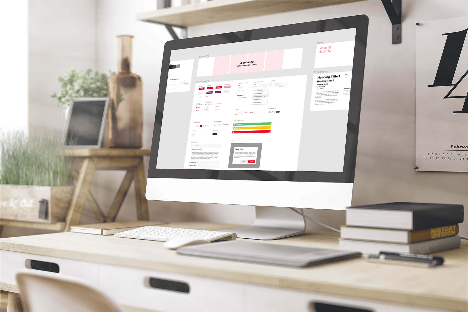
Figma API part 1: OSI’s Design naming convention. (FREE Figma template)
We at OSI use Figma template for our Design Naming Convention for a wide variety of projects. In practice, we use it for the development of any type of user interface – Mobile Apps, Website, Single page applications, etc.
This template has benefits mainly for designers, but in order to take advantage of its full potential, the naming convention should be implemented by front-end developers so that both parts of the process are synced and the code reflects the design as much as possible.
Foreword…
Figma is an interface design application that runs in the browser. According to a number of designers and teams, this tool is probably one of the best applications for team-based collaborative design projects. It helps teams create, test, and ship better designs from start to finish.
Why we chose Figma Studio? The main reason is that Figma Studio is a tool that combines everything we need – components and design systems, vector editing, prototyping, collaboration, even some basic animations, and it’s full of smart shortcuts and tricks that greatly speed up our workflow. This tool also stores everything on the cloud so it’s always easy to work together with the team on the latest file version, but at the same time, it also includes functionality to revert to older versions.
Before creating our Design Naming Convention we use at OSI, we have looked through a few other wireframing libraries. Combined with our own design experience we built the naming convention that will suit us best.
If you are interested in using this Figma template, you can download it for free at the bottom of this post, play with it, apply it to your company’s processes and modify it according to your needs.
Here we present a short description of how to use the Figma file template for our naming convention purposes.
The Goal
The idea of the design template is to have a naming convention for styles, fonts and basic components so that we can automate the process of handling design specs to the developers and then render them in code. This could be accomplished integrating Figma API with Front-End workflow. When starting a new project – copy the template and start designing in it. The designer uses the template for his projects by changing styles without changing the name convention of the layers. Adding new components should also have the same structure as the default ones.

Short User Guide
Components
Components that are identical to others but have additional elements should be coupled with the older components. For example – form dropdown has the same style as the input field but has an additional arrow indicating that it’s a selection field. We want consistency and as minimum changes as possible so we are creating a new component that includes an instance of an input field and adds the new icon for dropdown.


Hover, Disable, etc.: If there’s an additional style for your component that is often used like for example hover – then include it in a separate group/frame inside. And present it in the components frame for illustration.
Component description: This is in case you are adding a new custom component. It’s good to use the description field in order to add information on how this component behaves or is used. Developers should extract this description and add it as a comment in their code.

Layout grid
Activate/Deactivate grid with Ctrl + Shift + 4 (PC) or Command + G (Mac). The width, columns and gutter should be described in text in this frame.
Changing Styles
The color palette and typography frames are just for visualization. Unlike components, local styles such as color, font style or effects are stored without visual component and can be applied to any element.So when you want to change color or font, go to the respective square or font and don’t detach the applied style, but select edit of this style.
Style naming: If you are adding a new style use semantic names and not descriptive. For example adding new background color should be named as light, extra light, dark, etc. or the place where it’s used i.e. “footer background”. Naming with a descriptive color like “red, green, etc.” will force you to change names when the client asks to change the color too, and this will result in a change in development which we don’t want.Effects like drop shadow or inner shadow are named in different levels according to the distance or depth that they’re imitating. For example Drop Shadow/Level 2 will appear to be at a greater distance from the background than the Level 1.
Style grouping: If you add new styles, you have to think about which group they belong to or create another one.
Naming the style with: <group name>/<style name>, adds the style to the group name before the slash. In such a way everything is tidy and styles of one group appear at one place.


Icons
Icons should be added in the Icons Frame. You have to make sure that each of them is grouped in a frame with the same dimensions. In this way, it will be easier for exporting all of them and creating an icon font for performance optimizations.
Scaling: Make sure that each icon’s content constraints are set to scale and are nested in a frame. In this way, you can swap icon components easy and they will have the same size as the previous one.
What’s next…
In our next blog post, we will continue the topic of the Figma template. We will explain how to hook the naming convention template with the back end to reflect the changes in the code on development environments. So, stay tuned.
Meanwhile, you can download your FREE Design template here.


